Inside/Out: Designs for living
The Peninsulist gets the lowdown on architecture, art, design and modern living with Jane Lawrence and Matthew Dearlove.
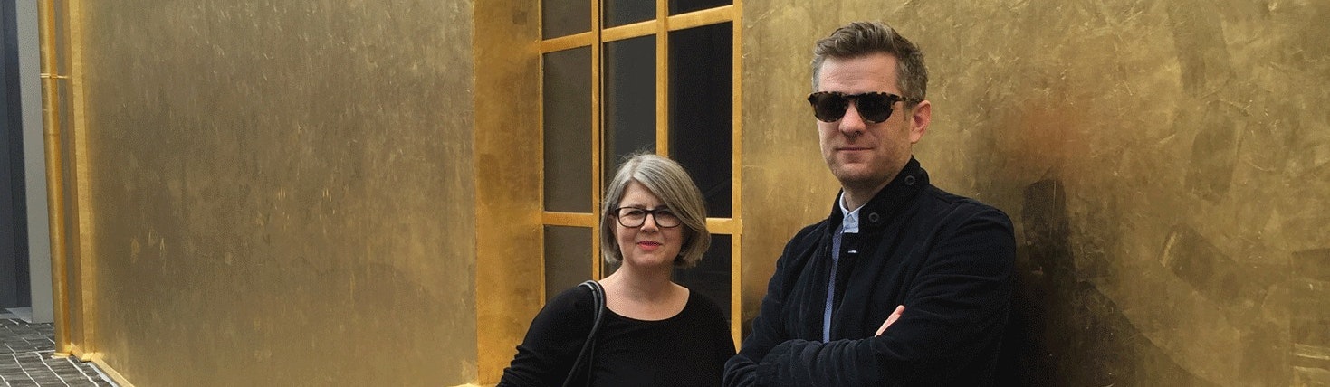
Introducing the first of a series of conversations with Matthew Dearlove, Head of Design, and Jane Lawrence, Interior Design Consultant at Greenwich Peninsula.
As well as getting an insight into their thoughts on design and personal inspirations, in this edition we find out what’s setting the world of interior design on fire, following Matthew and Jane’s visit to the world-famous ‘Salone del Mobile’ furniture fair in Milan.
What are the key trends for 2016/17?
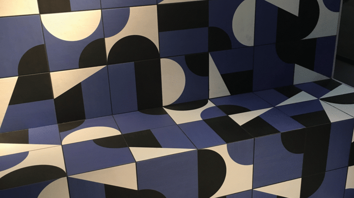
Jane: Two palettes seem to be dominating: the first an array of deep, painterly colours. Bold, vivid and sophisticated. Inky blues and reds, smoky oranges and mustardy yellows.
The second palette, almost a complete contrast, is a continuation of the pastel trend from the last couple of years but with a richer variety. Pinks were still prominent but these took their inspiration from the ‘Memphis’ design movement of the early 80s, so had a slightly edgier, sharper tonality.
The interesting thing is that we are starting to see colour where we don’t normally expect to see it. For instance in brassware, including kitchen and bathroom taps in shots of black, white and copper.
Matthew: Prints are big, bold and very graphic. A big trend for me however is planting – greenery. How an indoor/interior living space integrates with a terrace or outdoor space, and the role of the balcony, the courtyard and the terrace.
Jane: In kitchens we saw a lot of plain, unpainted or timber cabinetry in Milan. Often with interesting detailing, such as inset panelling, topped with very ornate stone/marble tops. Metal-framed cabinetry was also a big kitchen focus.
Matthew: There was also an honesty in the materials, a rich, raw beauty with less gloss and more timber. The marble and stone we saw in Milan was out of this world; incredibly unusual striations and marbling; nature at its most surreal.
Jane: Another trend is the break down of kitchens, which are moving away from the traditional top and bottom cabinetry to a more freeform design including open shelves and pigeon-hole units.
Matthew: And greenery again featured highly. Hydroponics and the art of home-growing. The focus was on small but perfectly formed indoor, sustainable kitchen gardens.
Milan Highlight?
Both: The Fondazione Prada!
Jane: It was really magnificent. The Fondazione is a blend, a juxtaposition, of a very industrial very boxy, modern, grey building which leans on an older, more ornate house that’s been completely covered in gold leaf by artist Louise Bourgeois. In one building you have a carefully curated collection of modern art, while the Louise Bourgeois building is a walk-through, permanent installation: ‘The Haunted House’
Matthew: And then there’s the very ornate café and bar, 1950s influenced, a little bit mad and very Italian. But it was designed by Wes Andersen, the Oscar-nominated American film director of ‘The Grand Budapest Hotel’. The building, on the other hand, was designed by architectural firm OMA, led by Dutch architect and architectural theorist, Rem Koolhaas. So it’s this intriguing mix of various schools of thought and approaches to architecture, art and design, that creates a dynamic and compelling re- use of industrial buildings, and is just a magnificent achievement.
Matthew: There were a lot of installations at the Salone that were more about brand amplification; that is, collaborations with brands like Pepsi, Nike, Jaguar and Cos, without a natural affiliation to interiors or furniture. Some of them, for example the cathedral-like Cos light installation, were very impressive but felt a little disconnected to the Salone and also a little too manufactured for the Instagram and Twitter generation. The Fondazione Prada is an incredible destination, with a variety of spaces you really have to experience.
The design that's impressed you the most this year is...
Jane: Not a design as such but Biomimicry, a hot topic that’s currently being discussed by designers and architects. FX magazine recently held a debate on the subject and I was on the panel along with other designers, architects, engineers and scientists.
Biomimicry is an approach to finding sustainable solutions by emulating nature’s patterns and strategies. It’s fascinating and could really change the way we approach everything from the way we build houses to designing the objects that go in them.
Matthew: The latest version of Apple TV. Its interface, ease of use, the fact that my four-year old son can use it as easily as an adult, which I think is so clever. Actually the whole notion of home automation with service integration like Amazon Echo and Google Home. The impact of Operating Systems and Artificial Intelligence, and their physical presence in the home, fascinates me.
I also really enjoyed the Alexander Calder exhibition at the Tate. Because it’s not just about the object, it’s also about how it’s presented. This was a strong feature of the Salone too; often the curation or presentation of the work was more in- teresting than the products or designs being featured.
If you could change one building in london it would be…
Jane: I would knock down the Walkie Talkie building. I don’t just dislikeit – it makes me angry.
Matthew: I find the sharp angles on the M by Montcalm building on City Road very aggressive. Actually… my house! I spend a lot of time thinking how I could redesign it.
On that note, favourite recent purchase for your home?
Matthew: I grew up just outside Lausanne so I love this 1983 print of Keith Haring’s poster for the Montreux Jazz Festival. It was an eBay purchase and is now hanging in our hall at home.
Jane: Two things: a vase from Ikea, not exactly revolutionary design, but a good size and shape. Ikea are now collaborating with established designers such as Ilse Crawford to design ranges of furniture and accessories for them, making really great design accessible to everyone.
Also, I came by a copper saucepan. I didn’t exactly buy it, but just before Christmas I was involved in designing an installation at The Sleep Conference that incorporated copper pans, and I…inherited one!
What's your go-to restaurant?
Jane: St JOHN in Clerkenwell
Matthew: La Trompette in ChiswickWhat's your go-to restaurant?
My new flat is a blank canvas. I want to personalise it but don’t know where to start…
Jane: When I’m designing for someone one of the things I do is create a moodboard, which begins to establish a sense of atmosphere, colours and materiality. Then you try to mix the things the person currently has with the moodboard and go from there.
In the new apartments at Greenwich Peninsula we’re thinking about adding a starting point to help people along, like a colour in the entrance/ lobby for instance.
Matthew: I guess one thing to say is don’t be afraid to ask for help. Something we’re considering at the moment is offering a service to buyers where they get to sit down with a designer for a day and put together a look and feel for their new flat, as well as a furniture pack.
Favourite app?
Jane: National Rail Enquiries
Matthew: Citymapper
Favourite viewing point in london?
Matthew: The window seat on the right hand side of a plane on its final descent along the Thames into Heathrow. London always looks amazing from here, day or night.
Jane: The view from the top of Centrepoint. Because you can get so close to the windows and I love the juxtaposition between the inside (which is tiny and quite claustrophobic) and the panoramic expansive outside view.