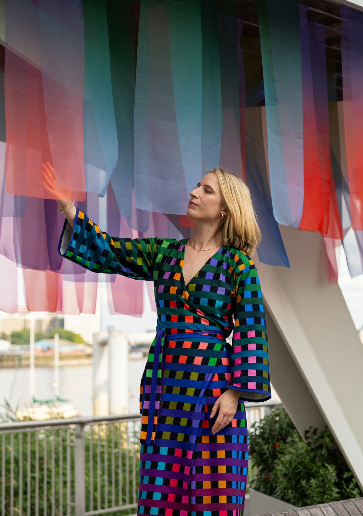
The Movement of Colour
Artists Ian Davenport and Marwan Kaabour have both drawn inspiration from the Thames for their installations on the Peninsula. Though their works are wildly different, the dialogue between them reveals the river’s hidden depths and our connection to it.
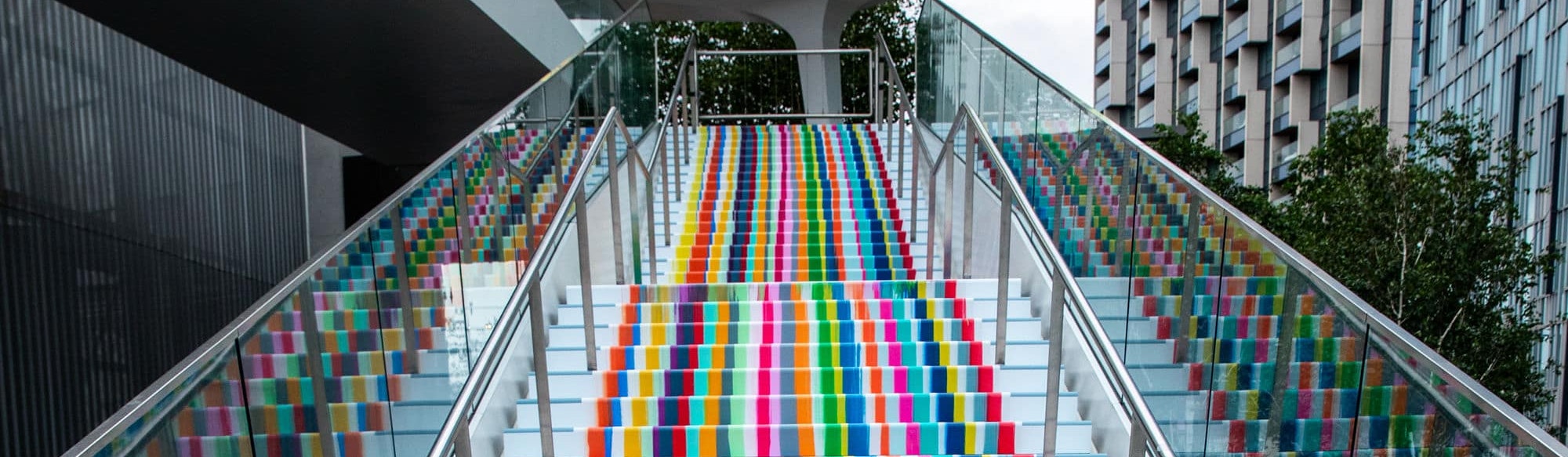
Emerging from North Greenwich station on one of those London days when the rain is bouncing and pooling on every surface, and the city is one grey puddle from pavement to sky, and people dash about in wet black coats, clutching sodden umbrellas, and even the dogs look miserable to be out, there is a burst of colour in the grey: the latest public artworks on the Peninsula. Ian Davenport’s Poured Staircase transforms the steps of The Tide into a river of colour, while Marwan Kaabour’s River in Verse turns the glass panels of the walkway into an iridescent exploration of what rivers mean to us: hope and fear, excitement and terror, discovery and loss.
“The thing you notice when you approach from the station,” says Turner-prize nominee Ian Davenport, “is just this big, open concourse. So I was very aware that you'll look at the work from 500m away, and then as you get closer it should start to reveal different aspects of itself.” And so it proves with Poured Staircase; at first it’s a bright smudge of colour, which resolves into distinct, vibrant stripes as you get closer, then at the foot of the stairs the rigid stripes break free to pool and swirl in flowing, organic randomness, adding a sense of fun and playfulness to the space.
While Davenport has done plenty of public art projects in the past, his works are usually confined to a gallery. In his most recent show, Lake, the stripes of his paintings poured off the canvas and flooded the floor of a Mayfair venue with an eight-metre pool of mingling multicoloured acrylic.
For The Tide staircase, Davenport had to translate his practice onto a three-dimensional, functional structure. The final work is in vinyl — necessary for a staircase that thousands will use — but it started out as a sketch in his studio in Peckham. “I wanted it to look like paint, so we mocked up a like-for-like replica of the staircase. We made the work in exactly the same way [as a regular painting], then photographed it to scale.”
Working in paint first was crucial to the effect of the finished work. “I hoped it would convey the energy and movement of colour being dragged down and pooled together,” he says. There’s a sense of natural force and flow to it that couldn’t be achieved any other way.
Poured Staircase and River in Verse were developed separately — the artists only saw mockups of the other’s work at a relatively late stage in the process. Any piece of public art needs to stand on its own, says Ian, but it was nice to see how the two pieces could interrelate. “They work really nicely, they’re not trying to do the same thing. I liked the different languages [in River], it’s very international, embracing lots of cultures. And mine is appealing to the senses. There’s a contrast, a juxtaposition, it’s a good meeting point of different things. It's a really nice bit of curation.”
Kaabour was pleased to see an overlap between the two; the bold and joyful use of colour, the sense of flow. “These pieces really kind of jump at you, especially on a grey day,” he says. And although there’s a dialogue between them, “they speak in their own distinct voice and aesthetic.”
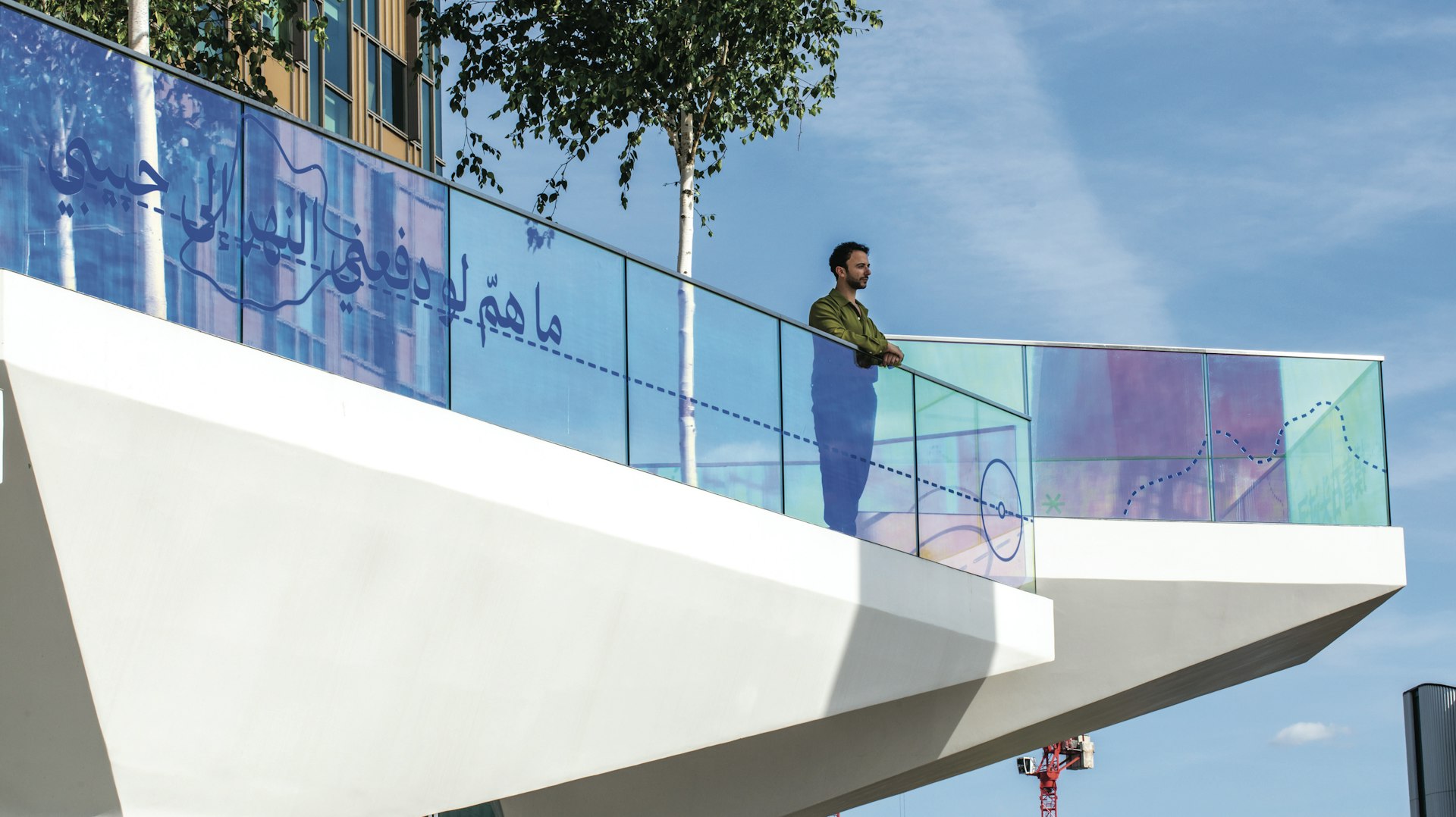
This is Kaabour’s first major piece of public art, but the process felt familiar, thanks to his background in graphic design. “My job for the longest time was to cater for a predefined brief,” he says. “I like to figure out what the limitations are, to see how I can play within them and challenge them, not just to accept them at face value.” He was commissioned based on his work with language and text, and River brings together lines of poetry with the abstract visual language of nautical maps. But in challenging the limits of the brief he explored how iridescent film could add another dimension to the work. “When I was first sketching out each panel, it felt too sparse. I wanted it to have a bit more fluidity. Iridescent materials move with the light and change with the weather. I wasn’t sure it was going to fit with the budget, but I showed [the commissioning team] how it would work, they were like ‘oh no, we must have this. We can’t unsee it.’” This almost accidental element of the piece has now become one of its most striking characteristics. As the light bounces off the river, the piece responds. “It just jumps at you,” says Kaabour. “It really pops.”
Kaabour’s process began with intensive research into the history of the Peninsula, tracing its transformation from an ancient marshy wildland at the edge of the city, to an industrial dock, and now its residential and commercial regeneration. Each period of the Peninsula’s history has been defined by the river, a tidal pull drawing together many people, languages and cultures. “I wanted this work to be relevant to the particularities of the space and its proximity to the river, and the people who live and work here.”
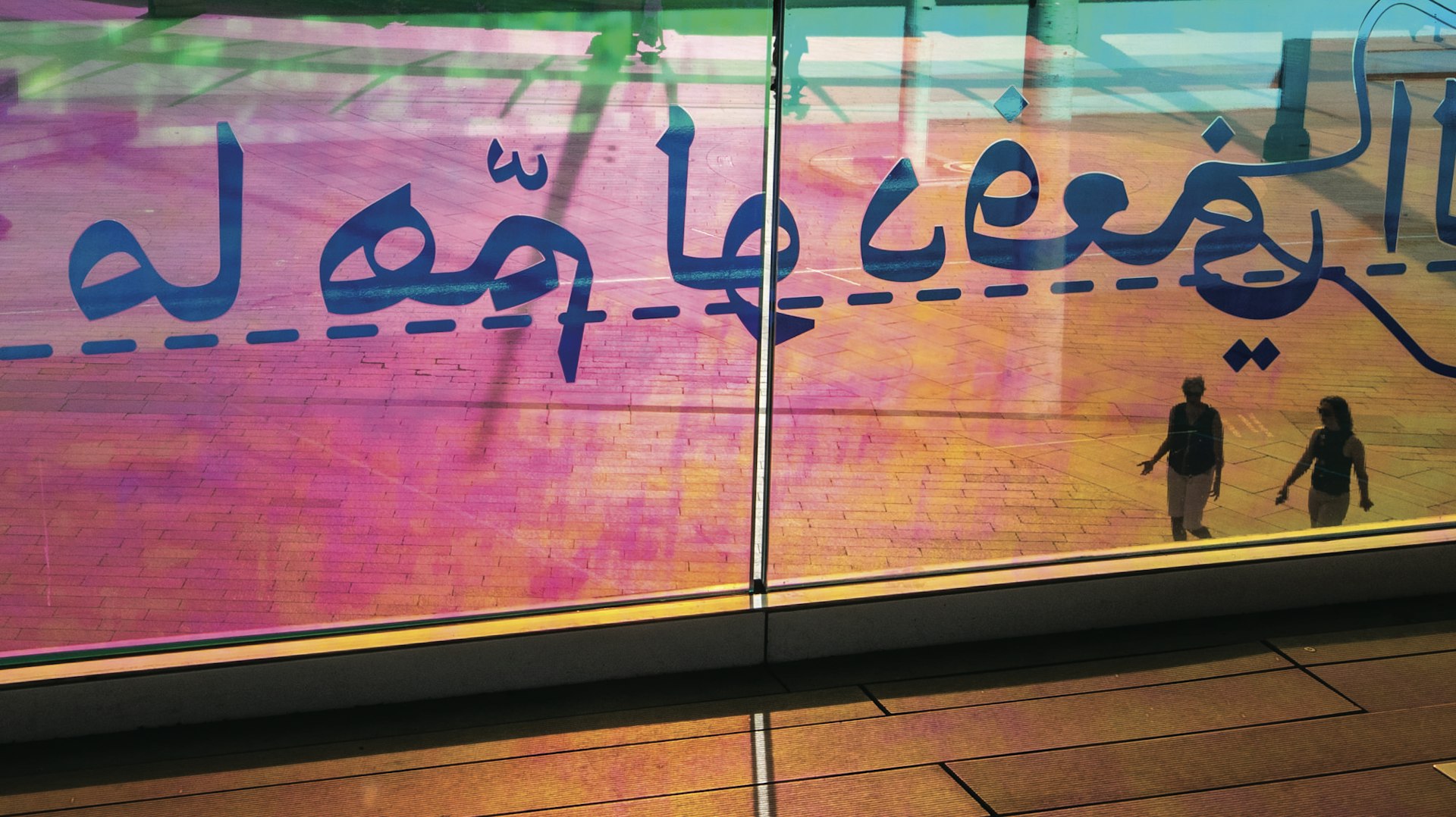
River in Verse collects fragments of poems and proverbs about rivers in many of the languages that have been and are spoken on the Peninsula. Kaabour interviewed native speakers to gather examples from their culture, and the final piece has lines in French, English, Arabic, Polish, Mandarin, Turkish and Greek. None of the fragments are translated or explained. They exist to be unearthed and discovered by the viewer, like a collection of treasures brought in on the tide.
For Kaabour, it was important that the work goes deeper than the well-worn tropes of rivers as beautiful, fluid things. “We can think of rivers and seas in terms of travel, exploration and excitement,” he says. “Or you can look at them in terms of climate change. Or people fleeing war and seeking refuge on a dangerous journey. It made sense to try and touch on all these things, not just the comfortable feelings of beauty and flowing water.”
The line on the first panel beside the staircase sets a tone of apprehension: ‘The river needs to take the risk of entering the ocean’. That sense of risk and discomfort flows through the piece, with fragments that speak of our essential, vital connection to rivers, and their mute indifference to us. Metaphorically, rivers are about memory and time, love and connection, life and death and letting go. But they are also just water and gravity.
The act of following the trail is itself a fragmented experience. At some point you are confronted with a language you don’t know, a world beyond your own. It’s uncomfortable to bump against your own ignorance, but the work sweeps you on regardless — indifferent as the river. The final lines at the end of the Tide are in Arabic, from Palestinian national poet Mahmoud Darwish’s A River Dies of Thirst: ‘There was a river here, / And it had two banks / And a heavenly mother nursed him from dripping clouds.’ For a world facing climatic and humanitarian crises, the words hang there, iridescent against a grey sky; standing watch, bearing witness.
Poured Staircase and River in Verse are free to view daily on the Peninsula.
Images by Victor Frankowski